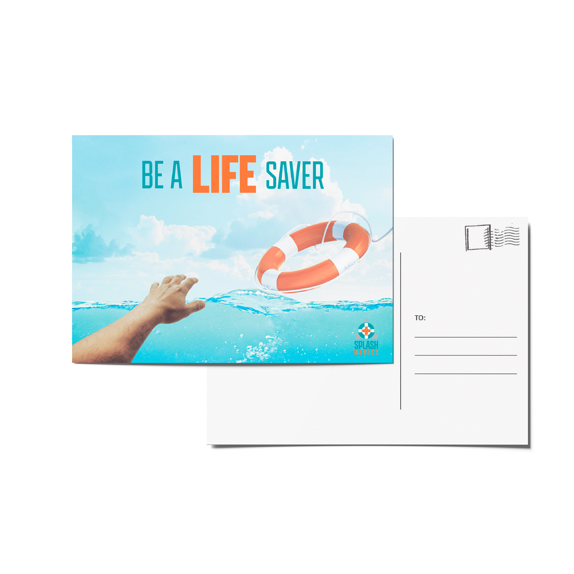
Splash Medics was a rebranding project that also included a packaging portion. This company is a non profit organization that works to help prevent child drownings by offering resources to parents and children related to water safety. The idea for the logo was to make something that was easily recognizable and also something that was bold and eye catching. The gray shape represents the shape of a caution sign, as this company is big on promoting safe water habits, which is why I also included the life preserver shape. As for the colors, the blue is tied to the color of water and then orange would be tied to safety and something that stands out against the blue. The round box is in the shape of a life preserver and holds their marketing items that would be mailed out to people who donate to their organization.